Color blocking entered mainstream fashion consciousness through Yves Saint Laurent's Mondrian collection in 1965 and has been periodically revived in more or less successful iterations since. The version that works requires understanding color theory, proportion, and the specific logic of contrast that makes the approach striking rather than clashing.
The Color Theory Foundation
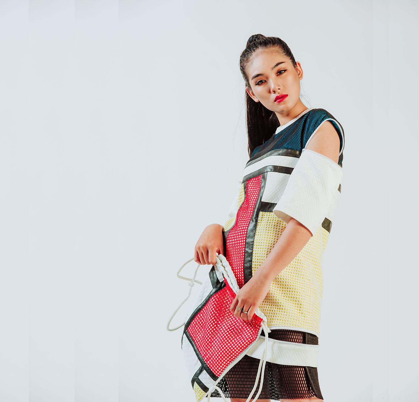
Successful color blocking draws from color wheel relationships rather than random contrast. Complementary colors, those opposite each other on the color wheel, produce the highest visual impact: orange and blue, red and green, yellow and purple. These combinations create a vibrancy from the complementary contrast effect that adjacent colors do not produce.
Tonal blocking, combining shades of the same or adjacent colors at different saturations, is a more accessible entry point that produces an sophisticated effect without the risk of looking clashing. All-blue or blue-and-green combinations demonstrate this principle.
The Proportion Rule
The most elegant color blocking uses unequal proportions: a dominant color covering the majority of the look with an accent color covering a smaller area. The classic two-thirds to one-third distribution, or roughly the upper body to lower, creates a focal point without the jarring quality that exactly equal blocks sometimes produce.
Keeping skin, accessories, and bag in one of the existing colors rather than introducing a third color prevents the look from becoming visually busy. Two strong colors in well-chosen proportions with coherent accessories is the formula that consistently reads as intentional.